The facelift
We knew that CryptoWiz interface wasn't exactly friendly. When it was created, it was made in a rush so the interface was sacrificed over functionality.
Not anymore. We reviewed the interface code and adapted it to mimic the user experience of the whole website.
We also reworked the manual and put a link straight in the CryptoWiz dashboard so it is closer to reach.
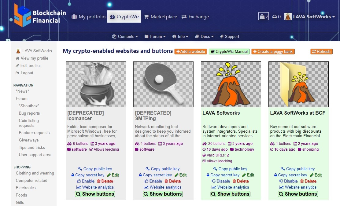
The new layout has grouped controls and the buttons for each website have been detached to independent views so you can focus on a website at a time.
Also, as you might notice, the link to the manual is up there in the controls so you can read it and familiarize with it.
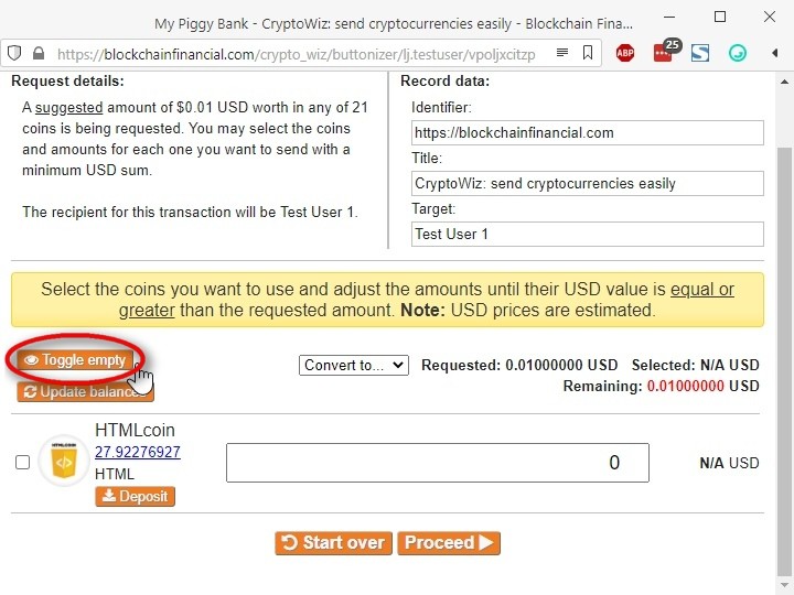
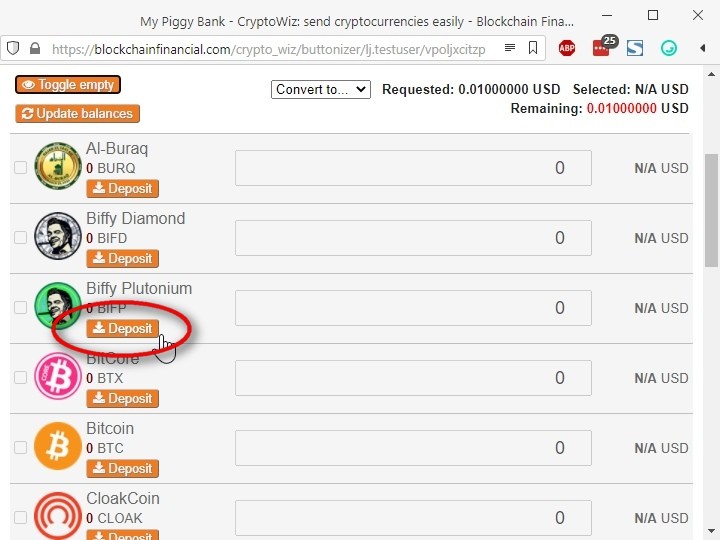
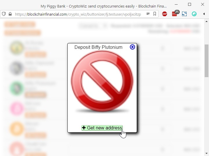
We also added two convenient functions on the widget itself: a "toggle empty wallets" button and a deposit button to show the address and QR code:
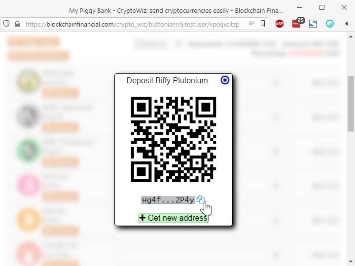
We also removed some controls from the widget and tuned internals for a better user experience.
We refactored the embeddable functionality
Recent additions to the chromium engine have strengthened privacy and security. One of the drawbacks for embeddable widgets like ours is that, as they run inside an iframe, they get blocked from accessing cookies. And since all web browsers except Firefox are based on chromium, we had to figure out a way for making the widget work on websites other than ours.
The good thing is that we've already done that in the past, so we did something similar for the widget and now it will be able to run without issues when embedding it in any website.
Other changes
As our platform runs on top of BardCanvas and some of their modules got updates to support some of our recent additions, we rolled up those updates. If you want to take a look at those changes, you can check the list here: bardcanvas.com/updates-2021-02-27.
Here's the list of other things we changed in our platform:
Template updated to version 1.3.0:
- Increased border visibility to framed content elements.
- Added 3d borders to buttons and button-like elements.
Portfolio module updated to version 1.14.4:
- Minor fixes in coins manager browser (available for admins only).
Exchange updated to version 1.6.4:
- Added filtering by payment method on the main browser.
Detailed list of CryptoWiz updates (for the curious ones):
- Refactored module layout:
- Standardized appearance controls with the website skin.
- Widget:
- Removed amount buttons to save space and changed input area to number with stepping and minimums.
- Added a button to toggle empty/non-empty wallets on multi direct/converted requests.
- Changed balance updater to cover all coins.
- Added buttons to fetch deposit addresses and show them.
- Code cleanup.
- Changed piggy bank default button creator scheme from multi_direct to multi_converted for all available coins.
- Added last update time to websites and buttons.
- Tuned bootstrap and target selection logic.
- Added checks to avoid JS issues in URL formations on the controller.
- Refactored in-widget login method to dodge CORS restrictions in recent browsers.
That's all for the moment. We continue working on improvements, and we'll notify when another big update comes forth.
Blockchain Financial has the next label sticked since 2 months ago:
 A great contributor:
A user that stands out for doing the right thing in the website. Cheers to you!
Sticked by
lii 2 months ago
• Source: Coins info
• Reason: N/A




 CoinMarketCap
 CoinPaprika
Click here to register now!